Colour Theory and Fills
Color theory and fills are where we tend to get far more technical with the craft. This is where you can implement a lot of the stuff we’ve previously talked about into action. Primarily the can control techniques within your letter structure. One of the next and most important parts of a graffiti burner is the ability to flex fresh fills, fills are generally what take your piece to that next level and really allow the artist to run wild and free with everything. If you rock out some nice letters but only have a solid fill, it can still be a dirty piece, or more accurately a straight-letter, but may not bring the ocular stimulation that other stuff can.
Background:
When you think about color theory at its most basic level, that’s the best way to think about it such as the primaries: red, yellow and blue; the secondaries: orange, green and violet; tertiaries: red-orange, yellow-orange, yellow-green, blue-green, blue-violet and red-violet.
That’s the basic colour wheel/chart that gives the majority of the colors we use in our spectrum and what’s the best way to use them. Now this isn’t to say you can’t break free of this stuff, like we have done with basically every other aspect of the graffiti practice, but it’s good to know these basics to ensure that you’ll always rock a dope piece.
As with anything, once you get far more advance you’ll start to branch into these new colours schemes that you never that were possible, but hit harder than anything you can imagine. There are certain writers out there that can bust out colours that most people would just not go paint with and they crush it.
But for beginners we tend to venture into the “K.I.S.S” principal and that is to say – keep it simple stupid. Some of the guaranteed schemes that we can use are always the complimentary colours from the wheel along with black outline and white highlights. This can get boring after a while, but it’s almost a guarantee that the piece will make sense.
Also, if you’re doing a simple instead of a full on burner, chrome, black and white is a go-to for almost everyone in the game. You’ll notice black and white pop up all over the place and that’s because these colours (or lack thereof) add much needed depth and contrast to any colour. Black as an outline with basically go over anything perfectly and white will highlight it that way too.
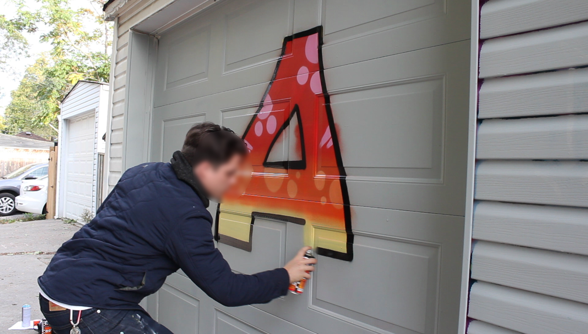
Furthermore, you can use the can control elements you learned and put them into action. Such as fades, flares, bubbles and all sorts of other gimmicks. One of the most classic fill techniques is the fade. You pick a selection of colour and fade them all into one another so there’s an effortless gradient going on. This is definitely a very good place to start as many colours within a piece can offer the viewer a ton of visual stimulation and adds a more rendered feeling touch.
Some writers tend to go with go with more graphic styles, meaning harder lines and more contrasted elements, such as bubbles, stars and bits. Again, there is no absolute right answer it’s all up to the artist. This as we discussed a little in the can control section, would have you using the can closer to the wall in keeping those lines crisp and solid.
When going with a far more rendered technique such as fades, gradients and various forms of tonality, odds are you’ll be dealing with fatter caps and further away from the wall to give the effects you want. The beauty of fat caps while spraying from a far away distance is the paint falls in such a great way that it adds more of an effect than you would assume.
Paint comes out of the can essentially in little dots. It’s hard to really tell in a way because generally when you spray out of the can it comes out far more opaque and covers extremely well. But the idea is that almost every time you spray there tends to be a little overspray and because of this the dots fall in such a manner that when they overlap other colours. So if you use the spray to your advantage, it can give you a far more elaborate gradient than you can with any other painting method.
If you were to use brushes and whether it be latex, oil or acrylic, you would be mixing up various tones of the colours you want to fade or you would be blending for hours, not too mention the surface area would be far smaller to cover. But with spray cans, you can cover massive areas and give some details and seamless fades and gradients by keep the caps on the can fat and far away from the wall.

Using the fine art or “painterly” context is a good way to think about fill and shading techniques is equating it to the likes of a fine artist, especially oil painters and go from dark to light. That’s a basic method of operation that a lot of fine artist and writers use, meaning you drop the base coat down the darkest shade and then you add the lighter shades on top of it until you get to the final highlight colour. This is a brilliant way to get the rendering right without breaking your back.
>> SHOP: Sketching Markers (Molotow, Stylefile, Ironlak…)
Tutorial:
- When doing fades in your letters, like you would on a burner or wild style, you’ll want to choose the gradient that you’d like to floss in your piece and stick to it. Often times we tend to choose colours that are in the same tonality, but this isn’t always the case and we will talk about that shortly. But for the sake of argument let’s start off with a blue fade.
- Pick which direction you’d like the gradient to go, whether that be dark to light or light to dark and top to bottom or side to side. Sometimes in graffiti we don’t often get a chance to be fully prepared, depending on space, legality and time limits, but generally, it’s best to keep your gradients in front of you the way you want to see it – let’s choose dark to light going from top to bottom for this one.
- If you’re going to go from dark blue to royal blue, to baby blue, put the cans in front of your surface going to paint and start making those first outlines of the colour section you’re filling in. Often times we choose to put the sections in equal parts, but this doesn’t have to be the case if you don’t want it to be.
- Also keep in mind what direction you want your actual fade to go, this meaning do you want to fade downward into the colours below or upward into the colours above. This tends to be a preference thing, but generally people like to fade downward. If you’re fading downward, it’s best to fill the section of your bottom colour first (that being the baby blue), then fill a section of the royal blue on top top of it and spray into it.
- Unlike doing your sketch lines or not-flared tags, you will want to have your can on an angle downward almost as if you’re fading toward the ground and slowly spray out the aerosol into the other colour moving side to side and slowly moving your body and the can away from the wall so it lets the spray particles fall into the other colour. You will then repeat this with the dark blue section going over the top of the royal blue section and now you should have a clean gradation going from the darkest colour at the top to the lightest at the bottom.
- If you are looking to do a more tie-dye fill, you can get far looser with your color choices, choosing a variety of different colours, shades and tones fading slowly into one another giving a plethora of colours all over lapping creating an extremely visually stimulating look.
- Your fill doesn’t need to be limited to just a fade, this is where you can continue having more fun and start to have funk. Nice touches to add over top of a fade are bubbles (circle shapes), stars and/or bars (square like shapes branching in and out of the letters). These are extremely useful when you’re going for a more detailed and wildstyle type aesthetic.
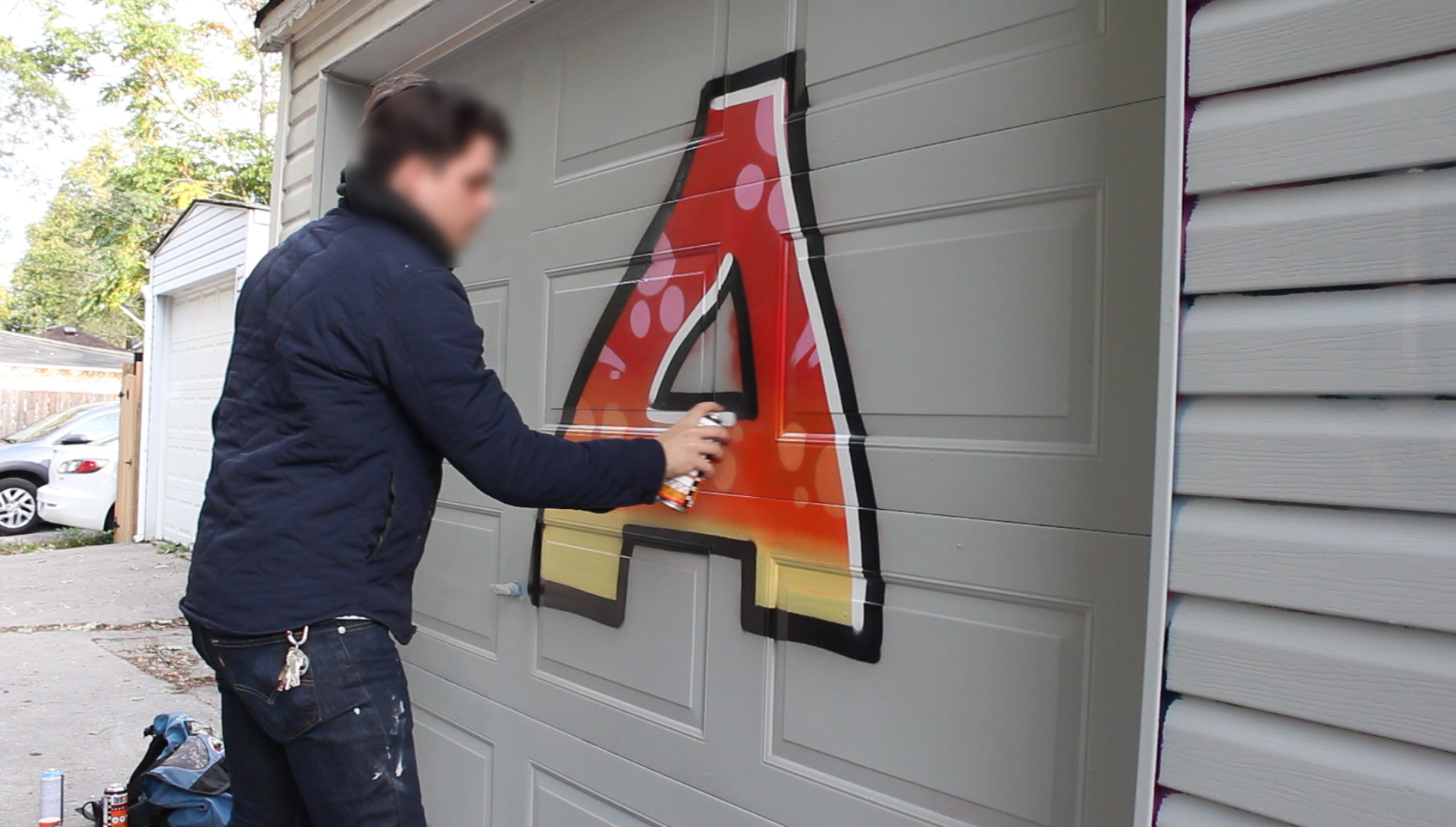
- Once you’ve completed your fill, this is where you choose to pick your outline colour, as we’ve said before it’s usually complimentary to go with a contrasting colour of what your fill is. With that being said, if you’ve done these blues you may want to outline with black to give the visual contrast to the eye so that the outline colour isn’t fighting any of the interior letter colours.

- That is to say with a dark outline for example. You might have a black or deep red outline and then you’d rock some pinks as your forcefields. This you would want to go from lightest pink next to the dark outline, to a lighter pink, then a lighter pink and so on and so forth.
- The opposite would be true if you’re rocking a white or let’s say, super light blue outline, you’d take the darkest pink then the lighter, then lighter and continue until you’re out of your palette. This can beef up the piece, add much needed size (like always) and add a fresh graphic gradient effect almost like a monochromatic rainbow.
- Once you’ve outlined your piece, what really helps give it that extra pop is adding highlights. In this case, you will probably want to add white highlights helping the letters as a whole tie together and look more three dimensional than they did before.

- These highlights can either be on the line or off the line. That is to say that if they connect directly to the outline letter and act as a buffer between the fill and the outline, this can more the letters pop and look more beveled. However, if you do them off the outline and the highlights are just floating more inset on the fill, they will give a more rounded three dimensional effect.
>> SHOP: Protection gear (Respirators, gloves, etc…)
Conclusion:
There are so many ways that we can use aerosol to create incredible effects that no other paint can and this is why it’s the most desirable tool for graffiti writers to use. It’s safe to say you’ll be hard pressed to see a graffiti writer painting a burner with a couple of brushes and bucket paint.


